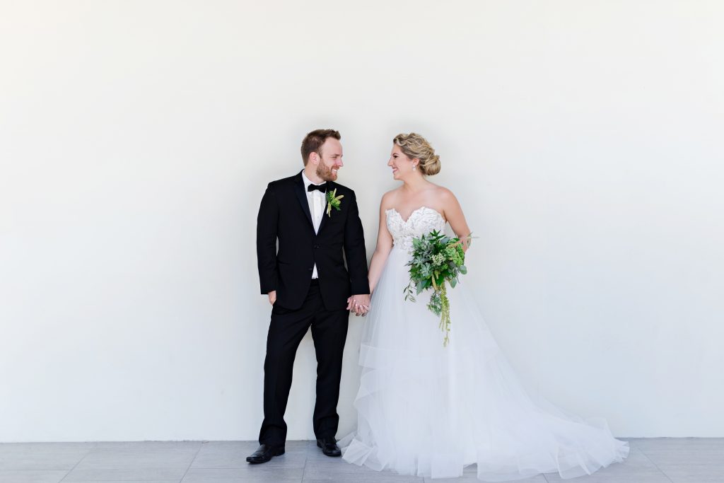
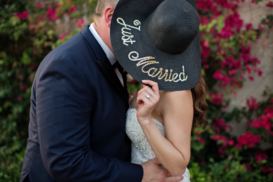
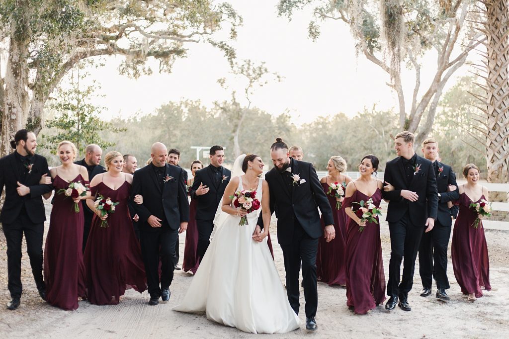
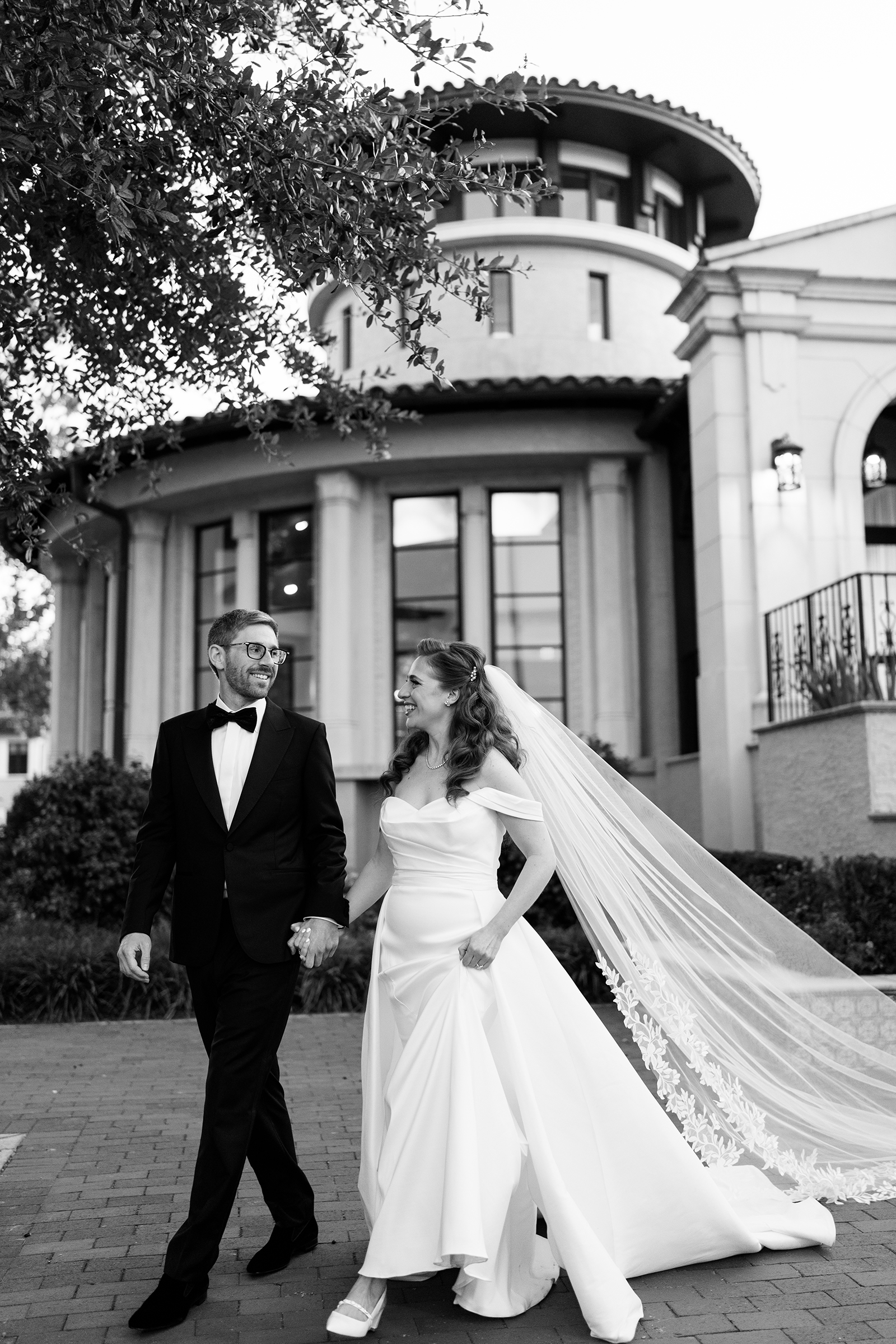
A few months ago, my dear friend Lauren from Every Last Detail blog told me about a new project from the Aisle Society team called Matchology. After hearing about the plans, I immediately went to their Kickstarter and backed them – signing up for a founding membership. Matchology has finally released to everyone, and I’m thrilled to start using it! After having it for the last couple weeks, I wanted to give me honest thoughts on the platform! So stay tuned for my honest Matchology review!
First, let’s back up
A large part of our workflow as photographers is submitting our weddings and shoots to blogs and magazines for publication. Not only does it provide valuable inspiration to newly engaged couples, but it is a great way to get our work out there for others to see. When I started in photography in 2009, getting my work published was a HUGE factor in my growth as a studio. It’s one of the easiest (and cheapest) ways to get a large audience to see your work.
Now, if you’re doing it right – that audience is specifically targeted to your unique shooting style. Selecting which publication to submit to was a huge task for us. More about that in a bit.
The original
Initially, as wedding blogs slowly took over the market, replacing the need to cut out magazine pages of inspiration (and well before Pinterest came to be), the blogs would have ways to submit to them. Typically, it was via email. This was a complicated process requiring photographers to resize images, write out vendors and stories for the couples and more. And every blog had different requirements! Meaning it would take hours to submit to one blog, finding out it was declined, and having to do it over for another blog.
Filling a gap in the market, Two Bright Lights was launched as a solution. And it was a great solution! For a minimal yearly subscription, we could have a single dashboard to view and submit our shoots – including the option to also send the images to vendors.
However, the process stayed a bit stagnant throughout the years. Publications would come and go – and recently, I’ve noticed more blogs going back to having their own system to submit. Updates were needed, and they were slow to arrive.
Aisle Society
Enter Aisle Society. When a group of bloggers got together to create Aisle Society, they gave photographers a new option for their work. Now, being published on an individual blog that was a member of Aisle Society, your work was ALSO published on the Aisle Society blog and promoted in both places. This was awesome for photographers, and we loved how these blogs took care us. But when these blogs developed Aisle Society, they also left the Two Bright Lights platform – and submitting to them became complicated again.
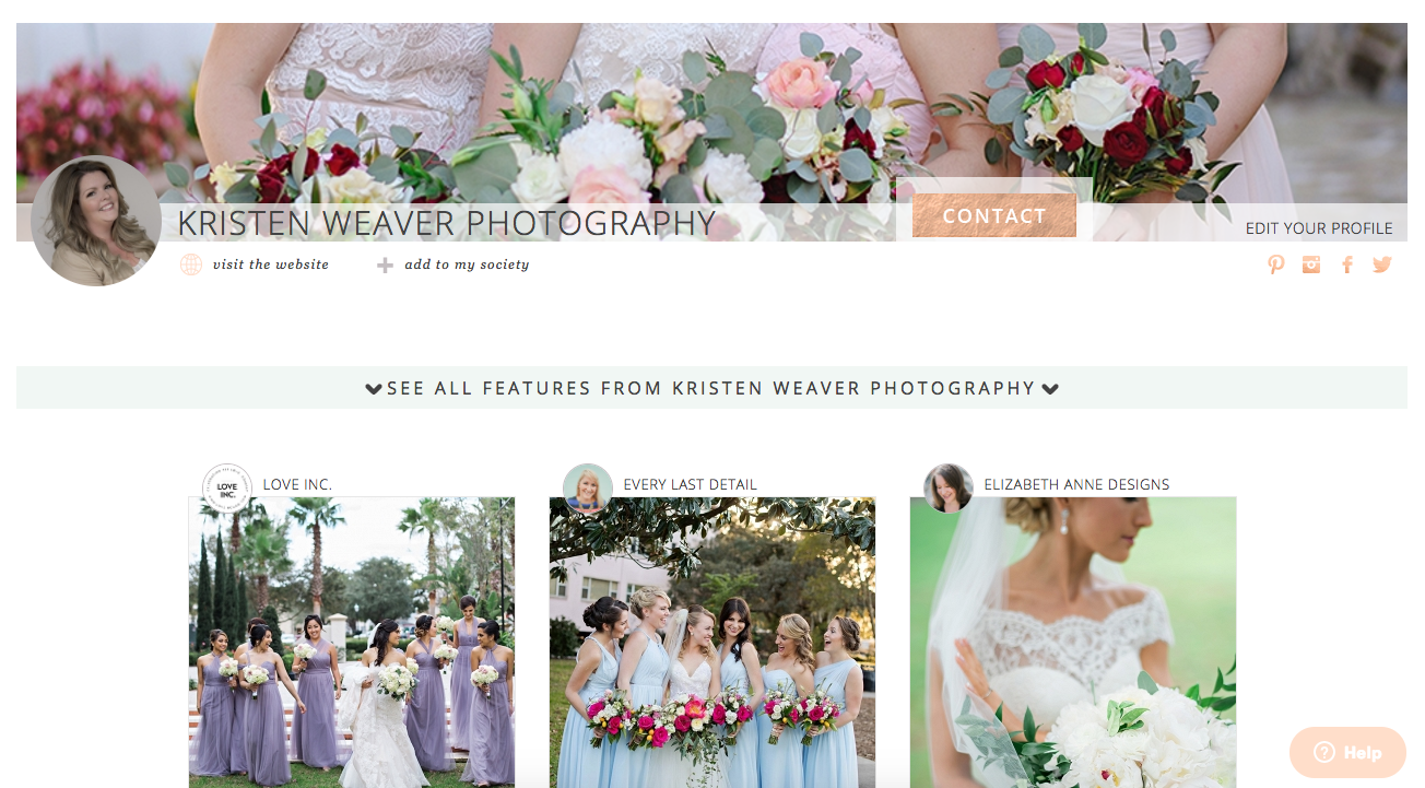
Check out my Aisle Society listing to see it in action!
Matchology
So they got together and developed Matchology. Slated to be an easy way to submit for publication with features that Two Bright Lights didn’t offer – like the ability to be MATCHED to your perfect publication with each submission, and sending clients questionnaires to fill out the information for their wedding.
Side note: these tools were mentioned on their Kickstarter when it launched – and Two Bright Lights responded by adding similar features before Matchology released. Having used both – I can honestly say the “matching” capability on 2BL is nowhere near the effectiveness of Matchology’s technology.
Matchology Review
So here we go. The good and the not-so-good. Let’s start with the good!
First, the interface is super easy for me to use and I love that! The dashboard is clean and simple. I would love to see a cover image for each listing – but that’s on my future release “wish list” for sure!
I was the most impressed with how easy it was to do an entire submission. Instead of having to resize my images, I could simply provide a link to the photos (from Dropbox, or your own proofing gallery). I easily select styles and key words, and the vendor listing is SO simply. From my first submission, nearly every vendor was already in their database with emails and websites – I barely had to do anything.
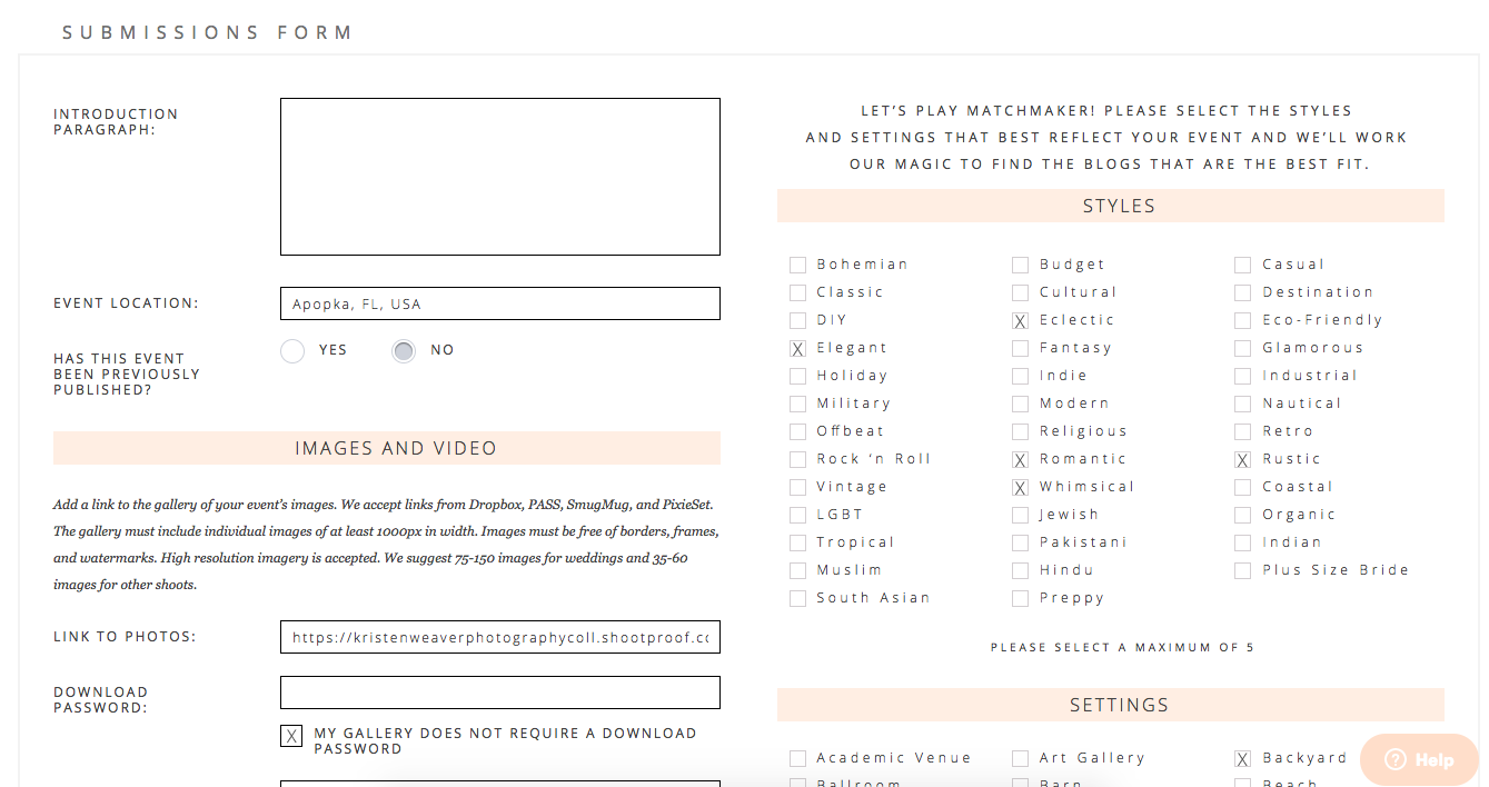
From start to finish, I was able to prepare an entire submission in roughly 5 minutes.
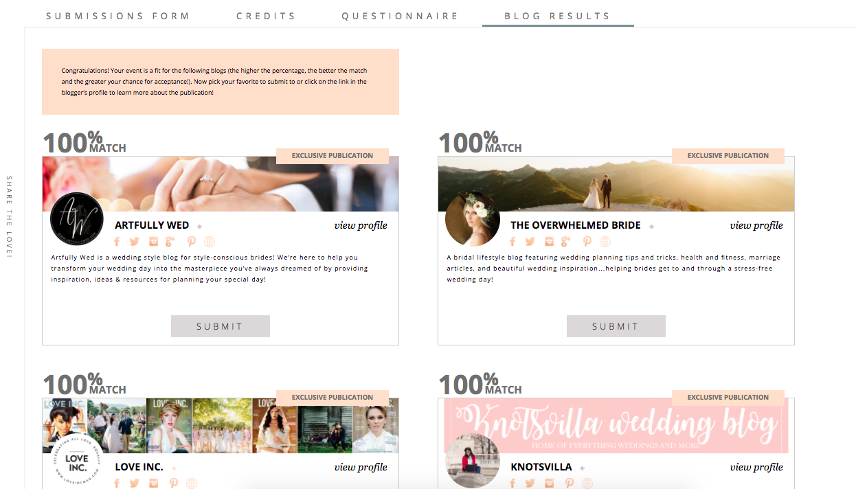
Once the initial submission was ready, you just hit “Match” and it brings up the publications that best represent the style of shoot you are submitting! You can scroll down the list and find less matches – this one in particular showed the range from a 40%-100% match. You could obviously still submit to any of the options – but it’s giving you the best opportunity for acceptance by selecting a higher match!
I also love that they have a slightly different setup for things like Elopements and Styled Shoots. Often they may not have vendors or even clients!
When you submit through Matchology, you also get status updates by email, one-click resubmission and copyright protection. That’s pretty huge for me.
It’s so good, because I’m OCD…
Sort of a pro AND a con is that I had to revise my entire submission workflow. I’m not that mad about it – it honestly needed done (where’s my shrugging emoji girl when I need her?!) So if you’d like to see my new workflow, I’m offering it to you for free HERE: matchology-workflow
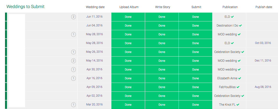
I also keep track (because I’m OCD) through our online task management software. I blurred out my client’s names for obvious reasons, but here’s a screenshot of what that looks like for me:
The struggle is real
My biggest struggle with Matchology is simply that you can only submit to Aisle Society bloggers. I’m definitely hoping that more publications choose to join Aisle Society. In the meantime, I’m still jumping around if I want to submit to a publication that’s not part of Aisle Society.
Aside from that, I love how open they are to suggestions! I’ve definitely sent in a “wish list” of minor tweaks I’d personally love to see (like a cover image for our submissions, adding the option for color palettes, etc). Since it’s only about 2 weeks old, I’m sure they have a list from many of their users that they’ll start rolling out in updates. I think they’ve actually already updated the platform this week with some new options.
How to join
If you want to try Matchology out, I have a great code to save you 20% on your annual membership. When you check out, just use code KWP20 (it expires 8/31/17).

Submission Advice
Also, if you’d like to rub elbows with the best editors and 700+ amazing photographers, join us on Facebook in Submission Advice! I started the group as a way for photographers to work together to help each other grow and get published!
Join us: https://www.facebook.com/groups/submissionadvice/
So there you have it! My FULL Matchology Review! Hope you enjoy, and let me know how it works out for you!


